Since I’ve posted last, I’ve been pretty busy. I joined the Professional Photographers of America, went to Chicago, shot a wedding, some engagement shoots, and some cool landscapes too! There’s one shot though that I thought was especially cool!
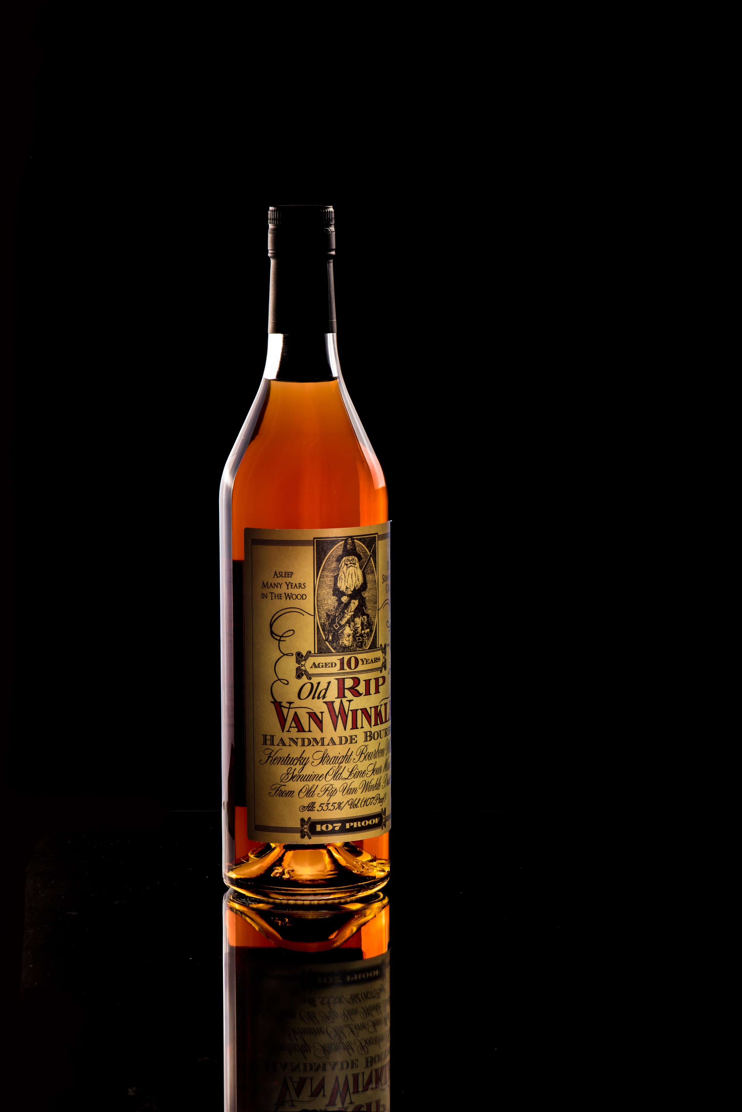
This is a bottle of Old Rip Van Winkle, one of the Pappy Van Winkle bourbons. Around here, and around the world, this bourbon is coveted by collectors and bourbon enthusiasts. It’s made at the Buffalo Trace distillery in Frankfort, Kentucky, only about forty five minutes’ drive from Louisville. If you’re ever around and in the area, it’s somewhere that you definitely shouldn’t miss - even though they’re not on the Kentucky Distillers Association’s official Kentucky Bourbon Trail. What they do have though, is Pappy Van Winkle, Buffalo Trace, Weller’s, Eagle Rare, Sazerac, and Blanton’s among others to check out on several tours and tastings.
To get that image though, I composited several different images together that I lit differently to get the effect I really wanted. I wanted to bring out that golden color of the bourbon, but make the label stand out and really isolate it against the black background really dramatically to highlight what an impressive bottle this is.
So the set up: I used a black piece of foam core on the table, and put a clear piece of glass on top so it would catch the reflections. Behind, I put another piece of black foam core just to clean it up. I used the Nikon D750 with the Nikon 105mm f2.8 macro, put it on a tripod, and only moved the lights between shots so that later in post, everything lined up as close as possible. On the lights, I used two strobes with 36 inch soft boxes.
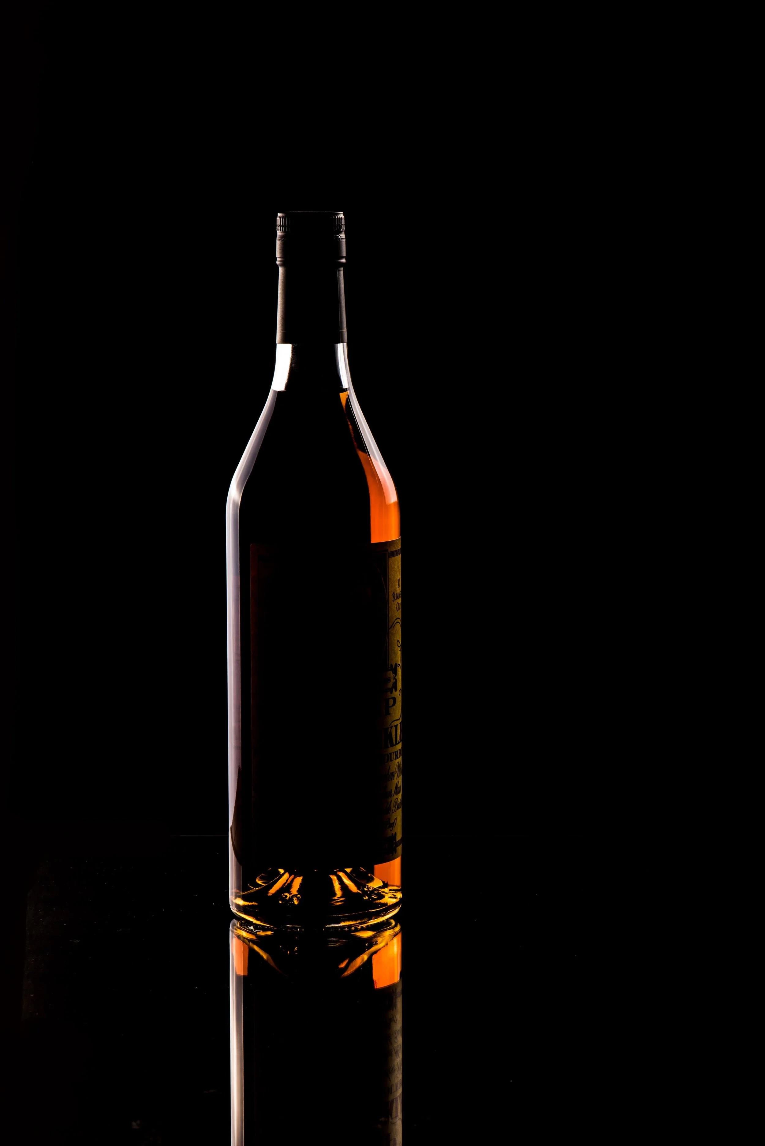
Step one: I lit the bottle from the sides to get the silhouette. That also let me mask out the shape of the bottle for the next step which would make it very difficult to isolate the color.
Step two: I put the light directly behind the bottle so the light would shine through it. To get the color right, I had to fire the strobe directly toward the camera through the bottle. That basically meant the entire background was blown out and completely white so isolating the shape of the bottle in the first step was important.
Step three: I lit the label from directly in front of the bottle probably 15 degrees off of to the right of the camera so that the shadow would gradually fade as we got to the sides of the bottle and the label. That made the rather unsightly bar codes and surgeon general’s warning’s black out look more natural.
Step four: this is a quick one. I overexposed the last image to bring back the reflection in the glass. I burned it a little to get a nice darker look and still keep the details in there. Because the glass is closer to the lens than the bottle is, I wanted to make sure the label in the reflection was slightly out of focus but keep it recognizable and legible.
Step five: when I shot step two, the light from the soft box was slightly over the level of the bourbon, so this is the part where I had to remove that glare at the top of the bourbon in the bottle. I also had to go back in this version to clean up some of those spots and imperfections in the glass ... and a few unintended fingerprints.
I changed the angle a bit next and got lower on the bottle, added a glass of bourbon, and then did that all over again to get the other shot! Anyway - it’s a good exercise to show that even without a proper studio, you can still get the effects you want in detailed product photography.


